10 Pros and Cons of Minimal Navigation in Web Design
There’s been a shift happening in website design for a while: navigation and menus are shrinking. Minimal navigation styles and elements are growing in popularity, despite arguments against the hamburger menu icon.
Although not all minimal navigation elements use this style, it’s certainly a visual style we’ve seen explode in use over the past few years.
But does it work? Should you consider using minimal navigation for projects? Here, we’re going to take a look at some pros and cons with examples of use. The answer might not be as simple as you think.
2 Million+ Digital Assets, With Unlimited Downloads
Get unlimited downloads of 2 million+ design resources, themes, templates, photos, graphics and more. Envato Elements starts at $16 per month, and is the best creative subscription we've ever seen.

Design Trend: Minimal Navigation

Minimal navigation styles can present in different ways but the most popular is probably with a hamburger icon.
This little divot featuring three stacked lines has become so common that most users can identify it. But the commonalities seem to stop there when it comes to minimal navigation. Hamburger icons have evolved to include only two lines, have varying placements on the screen (could be on the left or right or middle) and are sometimes combined with other navigation elements.
Other times, minimal navigation doesn’t use a hamburger at all. Right away, it’s easy to see that there are plenty of options for minimal navigation, but not a whole lot of consistency. Therefore, this trend can create plenty of design opportunities … and challenges.
Minimal Navigation Pros
There are plenty of situations and website design schemes where using minimal navigation works beautifully. Minimal nav allows for striking designs without clutter and the concept is becoming something that is a more commonly accepted user pattern.
Small Nav Elements Have Become the Norm

Thanks to mobile dominance, small navigation elements have become quite the norm. Users accessing websites on mobile phones are used to streamlined and minimal menu items, including ones that are hidden in hamburger-style icons.
Once a user flow or pattern becomes commonly accepted, there’s not a lot to worry about in terms of usability or confusion for website visitors. And while minimal navigation is common on small devices, it poses a question as to whether there is a different expectation on desktop screens.
Users Know Exactly What You Want Them To Do
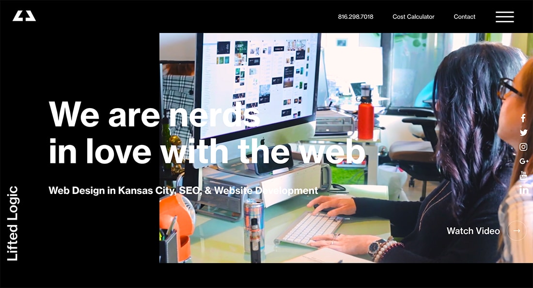
As long as users understand what you want or need them to do with the design, minimal navigation styles are quite effective. But note that minimal does not mean “no” navigation.
The minimal style navigation from Lifted Logic, above, shows how efficient and effective minimal navigation can be with a hamburger menu to tuck away some elements, with the primary items still across the top of the screen. This middle ground, minimal style makes the design easy to use and creates a clear user journey.
Pop- and Slide-Out Navigation Can Provide More Information
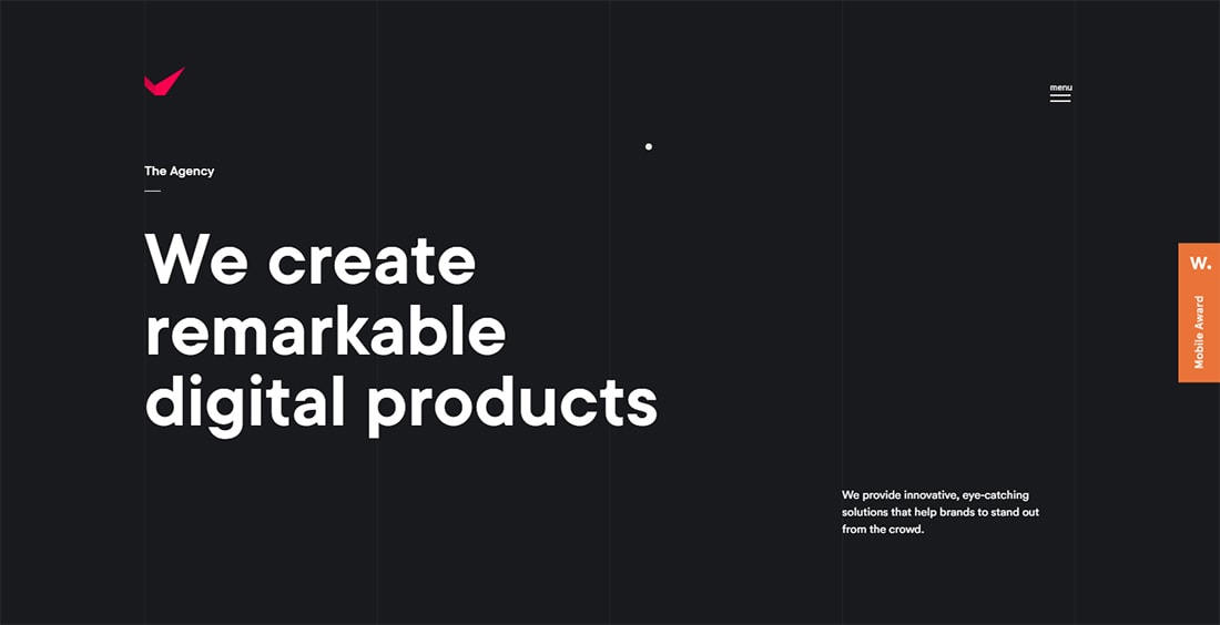
One of the best things about minimal navigation is that it can expand to a much more inclusive style with additional context and information when the user wants it.
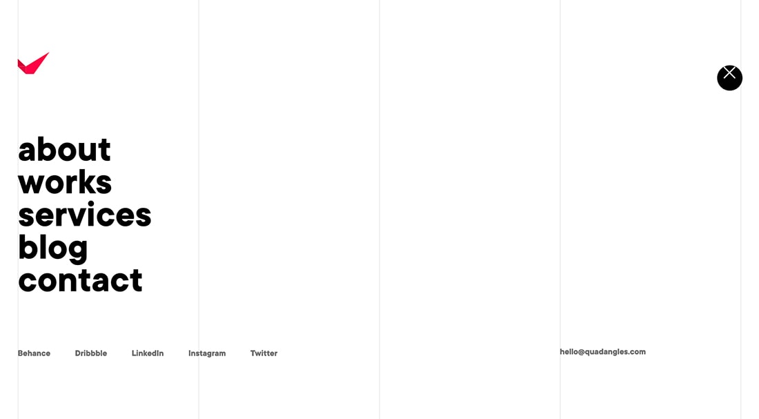
This concept works great in the design for Quadangles, above, which provides links to content throughout the website as well as social media in the expanded navigation pop-out menu.
Minimal Navigation Gives More Room to the Design

One of the best design elements of minimal navigation is it cleans up the rest of the canvas, so the design can breathe and flow. You aren’t going to feel pressure to add a white bar at the top of the screen or fade a photo to accommodate small text buttons.
This clean canvas can provide a solid backdrop for doing something special with the design and make you worry less about whether navigation is in the way or even if it is readable.
Minimal Navigation Forces to You Consider Other “Entry Points”

Finally, minimal navigation makes you consider other ways to get users to focus on the website journey. This may include clickable calls-to-action throughout the design, card- or button-elements that encourage jumping to other content, or a scheme that directs users to other pages.
Going into a design with this plan in mind can help you rethink and reshape conversions and focus on key actions/interactions between the website and user. Even if the design doesn’t make it past iterative stages, thinking through a minimal navigation plan can help focus your goals for the project.
Minimal Navigation Cons
Minimal navigation isn’t for every project. Much of the basis for choosing this style – or not – has to do with content and personal preference. But there are some deeper reasons why minimal navigation might not be the best solution.
Some Users Won’t Find What They Are Looking For
The primary issue with minimal navigation is the potential for users to get lost. For as many users that understand the “home” button is a site icon, there are ones that can’t seem to get back.
That’s true for every one of those navigation elements. Before moving to a minimal navigation style for a redesign or design tweak, take a look at your analytics and traffic. How many people are using those elements? Are they using all of them? This can help dictate your plan moving forward.
Deprioritizes Content
Minimal navigation can also deprioritize content in a way. Most users think of navigation elements as being the most important pages and content in a website design.
But what if nothing is there? How so they know where to navigate to next?
This can create a concern if the rest of the design doesn’t help the user find what they are looking for. Minimal navigation needs the support of the rest of the design to be truly effective.
Can Have Potentially Low Engagement
Consider trying a button-style design for navigation rather than a hamburger icon.
This might seem like a tiny layout adjustment but could combat one of the biggest issues with minimal navigation – low engagement. Buttons, by design, are more clickable. Change the design and keep the function the same. Test it. Are more users clicking?
Potential Negative SEO Impact
Fewer words on the page provide less opportunity for robots and indexing engines to read and understand your content. While this can have some impact on search engine optimization, the impact is generally low.
It is most impacting of SEO if users bounce quickly or don’t stay with the design because they can’t find content. Be aware since it can be a slippery slope.
It Can Get Lost in Busy Designs
Minimal navigation presents challenges if the overall design is crowded or busy. Without a lot of heft to carry menu items, this style can get lost in the design, rendering it ineffective.
For this reason, you do see more sticky navigation bars in white or dark boxes, even with a small number of choices to ensure that each is readable and understandable at a glance when there is video playing, high color or motion graphics, or photos with a lot going on.
Conclusion
Personally, the depth and dominance of navigation depend on the content. Small websites without deep pages might not need it, although I almost always feel that it is necessary for websites with e-commerce. (The shop and cart menu items should always be present.)
Another real factor is the audience. Younger audiences or those primarily accessing your website with a phone are more likely to see and use minimal navigation with ease. (Traditional menus don’t work well in this format.) Desktop users, on the other hand, can glean a lot of extra information about your website from the words and choices in a navigation menu.
That makes this topic a difficult one. While minimal navigation is becoming more popular on all devices, the better option for many might be a more “full” navigation style on larger devices such as desktops and a minimal style on phones or small devices.
As with any new idea or concept, pay attention to your analytics and users. If you move to a more streamlined navigation format and users quit visiting multiple pages or key pages in the design, you might want to rethink the decision. Conversely, you may find that the navigation isn’t really a contributing factor in the user journey and a minimal style is just fine, and more aesthetically pleasing.