Trends / 4 Feb 2021
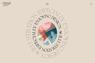
Design Trend: Text That’s Not Readable
Let’s start with a definition. Readability is a measure of how easy a piece of text is to read. The level of complexity of the text, its familiarity, legibility, and typography all feed into how readable your text is. Readability is a key factor in user experience.
Why would we ever showcase a design trend that features text that’s not readable? Simply, because it is popular. Does it mean that it’s a good idea? It… depends!
You can read on, look at the examples, and decide if it is right for your projects.