UX Design - Page 3

Tips for creating designs that give the user a delightful, clear, and well-planned experience with a high-quality UX (user experience).

Design Trend: Modern Tappable Targets (And How to Do It)

Mobile / 15 Oct 2020

Design Trend: Modern Tappable Targets (And How to Do It)

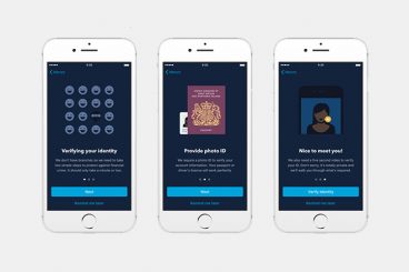
A solid tap target can make or break your mobile website or app. The size, shape, location, and overall design of the button or link determines whether a user successfully completes an action or not. It might seem like a small thing, but can be one of the most important elements of a design.

Modern tappable targets are easy to recognize, work in an expected manner, and encourage engagement.

Today we’re looking at how to design them, ways to craft effective call-to-action items, and considerations around color and font choices.

Is Your Design Inclusive? (And How to Make It More Inclusive)

UX Design / 18 Aug 2020

Is Your Design Inclusive? (And How to Make It More Inclusive)

Is your design for everyone? We talk a lot about creating with an audience in mind, but it’s important to understand that audience can identify in several ways.

Now more than ever before, it is important to create designs and visuals that are inclusive of that entire audience segment. An inclusive aesthetic will make users feel like they are part of the design and that a company, organization, or product is for them.

Inclusivity is more than just accessibility. It’s a combination of function and visual design that creates something that people identify with and want to be a part of.

It’s time to check yourself and your designs, put aside your biases and take a hard look at projects to ensure they are as all-encompassing as they can be. Let’s get started.

10 Pros and Cons of Minimal Navigation in Web Design

Navigation / 17 Feb 2020

10 Pros and Cons of Minimal Navigation in Web Design

There’s been a shift happening in website design for a while: navigation and menus are shrinking. Minimal navigation styles and elements are growing in popularity, despite arguments against the hamburger menu icon.

Although not all minimal navigation elements use this style, it’s certainly a visual style we’ve seen explode in use over the past few years.

But does it work? Should you consider using minimal navigation for projects? Here, we’re going to take a look at some pros and cons with examples of use. The answer might not be as simple as you think.

10 UX Phrases and Terms to Know Right Now

UX Design / 4 Sep 2019

10 UX Phrases and Terms to Know Right Now

It seems like the world of the web – and web design – is changing every few days. Trends, new techniques and users who demand more are driving this change. And we all have to stay on top of it to remain relevant.

Today, we are going to look at 10 phrases that you need to add to your vocabulary right now.

Each of these words or phrases relates to user experience, and in essence are part of the design process. Without further ado, let’s get started!

The Difference Between UI and UX

Graphics / 27 Aug 2019

The Difference Between UI and UX

In today’s creative and technical environment, the terms “UI” (User Interface) and “UX” (User Experience) are being used more than ever. Overall, these terms are referring to specialties and ideas that have been around for years prior to the introduction of the abbreviated terminology.

But the problem with these new abbreviations is more than just nomenclature. Unfortunately, the terms are quickly becoming dangerous buzzwords: using these terms imprecisely and in often completely inappropriate situations is a constant problem for a growing number of professionals, including: designers, job seekers, and product development specialists.

Understanding the proper separation, relationship and usage of the terms is essential to both disciplines.

5 Really Useful Responsive Web Design Patterns

CSS / 30 Jul 2019

5 Really Useful Responsive Web Design Patterns

Responsive web design requires a very different way of thinking about layout that is both challenging and exciting. The art of layout was already complex enough for the centuries that it was defined by fixed elements, now things are becoming exponentially more complicated as layouts become increasingly adaptive.

To help reprogram your brain to consider layouts in new ways, we’re going to take a look at some interesting responsive design patterns that are being implemented by talented designers all over the web.

How to Design a Perfect Website Onboarding Process (With Examples)

UX Design / 5 Jun 2019

How to Design a Perfect Website Onboarding Process (With Examples)

Think about the last time you downloaded a new app or landed on a new website. Did you know exactly what to do? Did the design help you engage with the site in a meaningful way? A simple onboarding process can make all the difference.

It’s important to think about website and app design in terms of onboarding visitors to create the best experience possible. This can include anything from helping someone find an item in your online shop and understanding how to make a purchase, to playing a game, or signing up for an email.

Onboarding is the process of integrating any new user into the design flow so that they can have the best interaction possible with your website, app or digital product or service. Here’s how you design it (with examples for inspiration).

15 Tips to Improve Your UX Writing

UX Design / 20 Feb 2019

15 Tips to Improve Your UX Writing

There are so many micro elements that are a big deal with it comes to user experience design. A lot of focus has been put on micro-interactions and engagements, but what about micro-copy?

UX writing is a big deal. The words, language, and composition of sentences and phrases throughout a design can make it or break it. (Think about how many times you’ve turned away from a website or app because directions were unclear, or a typo made you angry.)

Today’s the day you should vow to improve your UX writing. It’ll make your website or app better. And it’ll definitely make users happier. Here are a few ways to do it.

What Are Dark Patterns? (And Why You Shouldn’t Use Them)

UX Design / 28 Jan 2019

What Are Dark Patterns? (And Why You Shouldn’t Use Them)

Dark patterns are website interfaces that cause users to interact with a website in a way that isn’t what they intended. They cause users to click through to a page, or even add an extra item to a shopping cart, without intending to.

From sneaky clicks to straight-up poor website practices, dark patterns are in more places than you might expect. Today, we’ll look at what dark patterns are, how to identify them and why you shouldn’t use this technique in your website or app projects.

If you think a dark pattern is a cute background image, you need to keep reading.

UI vs. UX: A Culinary Comparison

UX Design / 8 Nov 2018

UI vs. UX: A Culinary Comparison

If the title of this article drew you in, there’s a good chance you’ve seen some kind of Venn diagram with a dozen circles showing the overlap between user interface (UI) and user experience (UX). This article doesn’t dispute any of that. But it does explain UI vs. UX in an alternate way.

One of the most powerful techniques a UX designer can wield is storytelling. Stories allow an audience to relate to a subject in a more meaningful way and hopefully help them understand it better.

Infinite Scrolling: Pros and Cons

Layouts / 26 Sep 2018

Infinite Scrolling: Pros and Cons

One-page websites are a major design trend. Especially when it comes to one-page designs packed with content, thanks to infinite scrolling techniques that allow designers to continue a webpage indefinitely.

This technique is great for some sites and content types, while for others it can be cumbersome and frustrating. Like any other design technique, you shouldn’t do it just because you want to try something new; it should be a strategic part of your design framework. So how can you decide? Let’s take a look at the pros and cons of infinite scrolling websites.

7 Tips for Better Contact Form Design (With Examples)

UX Design / 10 Sep 2018

7 Tips for Better Contact Form Design (With Examples)

Better contact form design starts with usability. The goal of a form is obvious: you need information from the user. The form has to be intuitive enough so users know exactly what to do and don’t get sidetracked in the process of completing that action.

The best contact forms are easy to look at and include highly usable elements that users can engage with without thinking about them. (It sounds a little easier than it is sometimes.) But thankfully, we have a selection of tips to help you design better contact forms.