UX Design - Page 6

Tips for creating designs that give the user a delightful, clear, and well-planned experience with a high-quality UX (user experience).

Attention Spans Are Short: Here’s How to Hook Users

Accessibility / 27 Feb 2017

Attention Spans Are Short: Here’s How to Hook Users

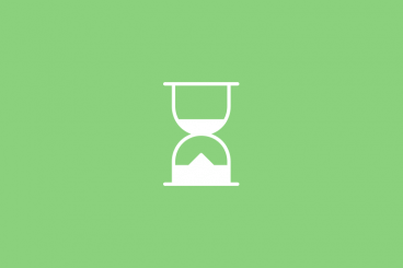
A goldfish has a longer attention span than you do. Let that sink in for a moment. Now, what are you going to do about it?

As a designer, it is your job to create something that people will stop and interact with. It takes a design and user experience that will hook visitors and keep them clicking and tapping. Combat short attention spans with smart design.

How to Design One-Tap Microinteractions

Mobile / 6 Feb 2017

How to Design One-Tap Microinteractions

Microinteractions are the “secret sauce” that make apps and websites shine for users. These tiny details make it easy to set an alarm, press a button or simply better understand how to work with a digital product.

The secret is that the best microinteractions are elements that the user probably doesn’t even think about. They happen in an instant – often with just one tap on a mobile screen. Despite the small nature of the interaction, hence “micro,” the value is immense to users as these engagements become more integrated with daily activity.

How do you design one-tap microinteractions that will delight users? Here are a few ideas.

7 Common UX Mistakes That Can Ruin Your Content

UX Design / 1 Feb 2017

7 Common UX Mistakes That Can Ruin Your Content

A successful project is a combination of good design, killer content and a little bit of luck. Too often a design is derailed by simple UX mistakes that ruin the content and muddle the intended actions of the interface.

Users can easily lose track of why they are there, and what they are supposed to do. Thankfully, many of these design mistakes are easy to identify and correct. (As a bonus, the examples in this post are doing things right; use them as a guide!)

How to Break the Grid Without Making a Mess

Layouts / 16 Jan 2017

How to Break the Grid Without Making a Mess

A grid is the foundation of almost any website design. These invisible lines help create rhythmic space and visual flow, so each project carries a sense of organization and harmony.

But you don’t have to stick to the grid 100 percent of the time. You can even break the grid from time to time without making a total mess. Here’s how you do it, while still keeping a website that’s a pleasure to use!

Design Techniques to Imply Scarcity

Business / 8 Dec 2016

Design Techniques to Imply Scarcity

How can you use design techniques to make things feel scarce? It’s an important concept, particularly in terms of creating a sense of urgency for e-commerce or clicking a call to action before it is too late.

Flash sales, limited editions, “only 2 remaining” – these are all triggers of scarcity that make a user feel the need to complete a call to action immediately. If not, the purchase or offer might not be available later. Designing for scarcity is an important concept in design, particularly for e-commerce and even in-person sales.

How Does a User See Design?

Layouts / 30 Nov 2016

How Does a User See Design?

There’s often a disconnect between the way a designer looks at a website or brochure or package and the way users see it. As a designer, you can appreciate trends and attention to typography and details in a way that the common user might not.

Users only know whether they understand something when they interact with it. The details of how that interaction happens or why it is pleasing are often lost. It’s a pretty harsh reality.

But there’s a nugget of wisdom in understanding that disconnect. If you think about what users are thinking, you will be a better designer. (Even if you don’t particularly like their thoughts on design.)

How to Design for Long-Form Content

Layouts / 22 Nov 2016

How to Design for Long-Form Content

Forget what you think about user attention spans. Long-form content can be a valuable part of your design strategy (and doesn’t have to be a boring block of ongoing text). Users love a good story and long-form content is a great way to create an immersive and engaging experience.

To keep users interested – and scrolling – you have to design interactions that are visually pleasing and create a consistent experience from the first glimpse to the final act. Here are a few ways to design long-form content that meets those goals with a few examples that are anything but boring.

Button Design Tips: Simple, Small and Vitally Important

Graphics / 17 Oct 2016

Button Design Tips: Simple, Small and Vitally Important

We talk about details a lot in design. It’s for good reason. Paying attention to even the smallest of details can make or break a design.

Today’s we’re going to dive deeper into one of those details and look at ways to design buttons that users want to click (or tap). Even though buttons might be one of the smallest elements in your design, they are one of the most important. How else would you communicate actions to a user? How else would they provide information in that feedback loop?

Think back for a moment to one of the big complaints about flat design in the early stages: Users did not know what was and what was not interactive in the design. Hence, the importance of great button design.

7 Tips for Delighting Users With Great UX

UX Design / 21 Sep 2016

7 Tips for Delighting Users With Great UX

A great user experience starts with the designer. You have to imagine and create something that people will want to touch and engage with, time and time again.

Sounds easy, right? The key to delighting users is to think like one. Don’t try to reinvent the wheel with every new design project; use tools and techniques that users like and understand to make the process a little easier and give you more time to focus on other visual elements. Today we’re sharing a few tips to get you focused on this line of thinking!

How to Design an Interface That’s Built for Speed

UX Design / 18 Jul 2016

How to Design an Interface That’s Built for Speed

Is your website slow? Be honest. Could it be faster? Users demand websites that load quickly and continue to deliver content without lag. If your website falls the least bit behind in meeting this demand users could abandon your site (and they might never return).

Today, we’re going to look at ways to make sure your website interface is built for speed, so you never have to worry about page load times again.

7 Tips for Designing Consistency

Graphics / 13 Jul 2016

7 Tips for Designing Consistency

Consistency will make your design better, easier to use, and practically invisible. It gives the user plenty of room to experience the design in the way you intend.

Designing for consistency is a no-brainer in some cases and a little trickier to understand in others. Quite simply, consistency is the thread that ties together elements in a single design. It also ties together designs across a single campaign or brand, creating a product that is distinguishable, usable and effective. Take special note of all the examples below, each brand is a leader when it comes to consistent and usable design.

Don’t Make These 10 Mistakes in Your App Design

Mobile / 4 Jul 2016

Don’t Make These 10 Mistakes in Your App Design

No matter what type of app you are creating, have created, or plan to create, design mistakes can be lethal when it comes to adoption and usage. Users want to download apps that are fun, functional and offer value during multiple uses. Users also want apps that are aesthetically pleasing and don’t require a lot of effort to interact with.

The problem for designers is that sometimes we are so close to a project that we miss glaring mistakes in design and usability because we know how it works. Today, we’re going to help you make a mental checklist of mistakes to look for and avoid in app design.