5 Cliche Logo Design Trends to Avoid
Logos are one of the trickiest things to get right in the graphic design world. It takes almost zero talent to make a logo — virtually anyone can do it. However, making a good logo requires a lot of insight, artistic skill, and patience.
Too often we see designers falling into the trap of rushing into a logo design project and coming up with ideas that are so overused that they’re downright cringe-worthy. Today we’re going to take a look at five logo trends that fit this description. Read on to see if any of your go-to techniques are on the list (and make a mental note to avoid them in the future!)
Are you in the middle of a logo design project? Learn more about how to make your concept stand out in our in-depth guide on how to design a logo!
7,000+ Logo Templates, Designs and Logo Builders With Unlimited Downloads
Download thousands of beautiful logo templates, logo designs, and anything you need to build your brand with an Envato Elements membership. It starts at $16 per month, and gives you unlimited access to a growing library of over 2,000,000 design assets, graphics, themes, photos, and more.
Who Cares About Being Unique?
Before we jump into some of the logo ideas that you might want to watch out for, let’s address the question of exactly why you should be aware of and perhaps avoid logo ideas that have become a cliché. The answer here cuts at the very core of why logos exist.
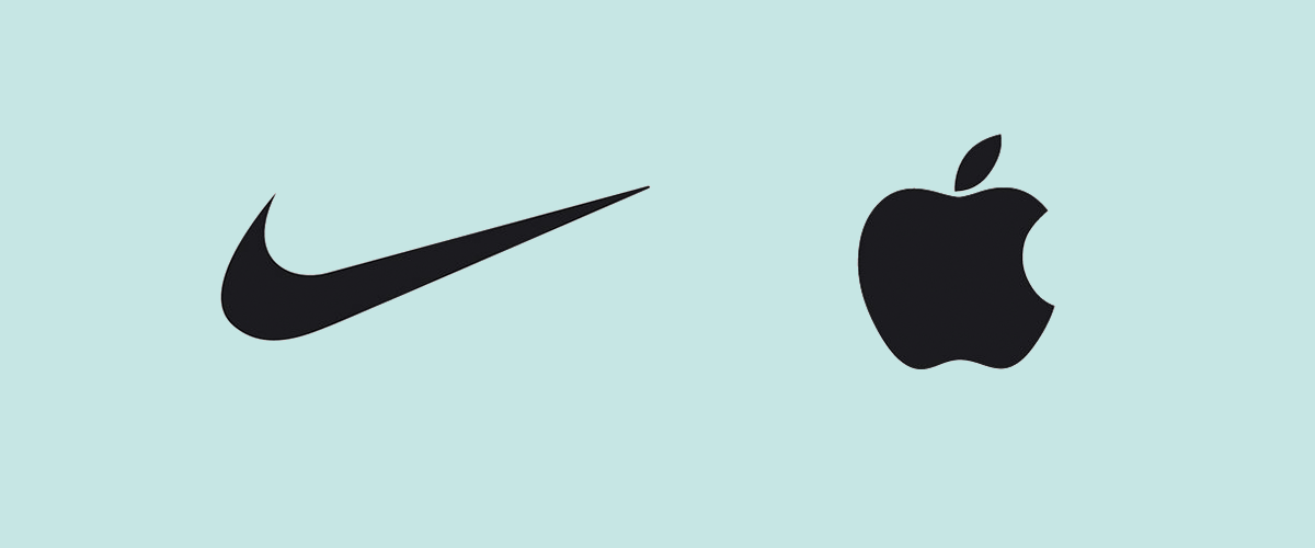
From a branding perspective, a logo is in many ways the face of your company. When someone thinks about “Nike” as an entity, they immediately see that famous swoosh, the same could be said of a million other brands such as Coca-Cola and Apple. This isn’t just true for global mega-brands either, who could forget the “Monster” energy drink with its claw mark “M”?
The reason you remember these marks so vividly is that they’re unique, and companies will fight viciously to protect that. Any time someone gets anywhere near a simple apple icon, the Apple Inc. lawyers unleash their fury with significant monetary backing.
Destruction from Within
If so many companies are willing to invest so much into their brand’s unique identity, don’t you think they see it as an important part of their success? Sometimes though, the most dangerous threat in this area comes not from competitors or other brands, but from people actually working for the brand itself! These individuals have the power to completely destroy a long held visual legacy and cause mountains of bad press for companies. The people I’m referring to are, of course, designers.
The past couple of years have been filled with long established brands attempting visual updates only to receive so much negative feedback and public outcry that they are forced to retreat back to their original but newly appreciated identity.
As a designer, you wield an immense power over the public perception of a brand. You owe it to your customers to provide rich, unique identities that won’t be easily confused with 3,000 other similar attempts by other brands.
With these ideas in mind, let’s take a look at five logo trends that designers just can’t seem to get over.
Arc Over the Top
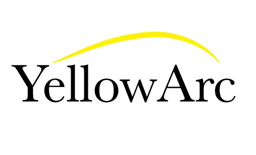
I can’t tell you how many logos I’ve seen use some variant of this idea in the last ten years. In concept, the idea isn’t a bad one. The arc indicates progress, movement, soaring over the competition; it’s a great symbol. However, it’s so overused in nearly the same exact way that it’s almost impossible to incorporate something like this into a logo and hold onto any semblance of a unique identity.
When you’re tempted to use an arc that looks like the one above, try to think about how you can drastically change the visual translation of the ideas you’re trying to represent. Surely you can come up with a few other ways to represent progress. As designers, this is our job: tying complex concepts into attractive and relatable visuals, not simply repeating ideas that we’ve seen a million times.
Helvetica
Listen, we’ve all done it so don’t bother denying it. At one time or another you’ve typed out a company name in Helvetica and thought “looks like a logo to me!” The problem here is that we completely lose sight of what a logo is all about, as I just ranted about in the opening paragraphs. Just because something is attractive doesn’t mean it makes a good logo. That’s an important concept so write it down in bold letters in your logo sketchbook.
Helvetica is a great typeface. I use it constantly and am certainly not in league with the anti-Helvetica crowd. Everything type lovers say about this typeface is true: it’s versatile and clean and works perfect as a blank slate that you can project ideas onto. However, without some major help, it can make for the most cliché logo imaginable. I’m not saying that you should never use Helvetica in a logo, just make sure that when you do, you have some really unique visuals to back it up.
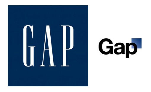
I’ll keep reminding you of the Gap fiasco every time I can because it serves as an important lesson where a brand tried to “update” their iconic look with a fresh logo. The result was a disaster and led to weeks of public embarrassment (and oddly enough the positive result of everyone realizing they love the old logo).
Not Just Helvetica
While we’re on the subject, keep in mind that this idea doesn’t only apply to Helvetica. There are plenty of other typefaces that are just as cliché or worse. I think the designer’s rule for using Papyrus should be somewhere along the lines of, “only use this if your computer has just two fonts and the other is Comic Sans.”
Random Colored Dots
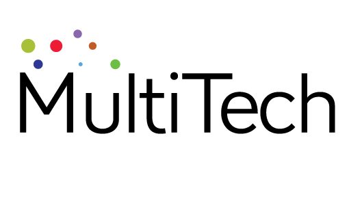
This is an odd one that I’ve been seeing a lot of in logo galleries lately. It’s not particularly attractive or appealing and often reflects a lazy attempt to represent diversity. It’s sort of like a bad re-imagining of a Wonderbread bag.
Some designers get particularly creative and actually take the time to arrange the dots into a symmetrical pattern, but the result is often just as generic and uninspired:
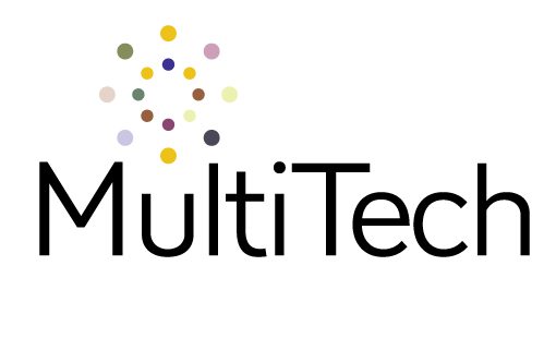
The meaning here is so vague that it’s lost. Further, you simply can’t get around the idea that you’ve seen this exact idea on a million other logos. It’s time to let the colored dots go. Rather than starting with some simple vector shapes in Illustrator, why not grab a pencil and spend a solid hour sketching out every idea that you can come up with? Trust me, at the end of the exercise you’ll realize that it was worth the time and effort.
Chat Bubble Logos
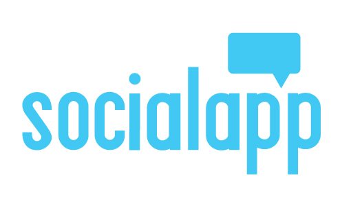
Four out of every ten logos created for social media sites have chat bubbles in them. I just made up that statistic off the top of my head but there are days when I would swear it was true.
Once again, we have a concept that there is nothing inherently wrong with. A chat bubble is in many ways the perfect way to represent social media. Also, it’s a good thing when you land on a symbol that immediately relates your concept. However, as a unique brand identifier, it isn’t an easy element to leverage without a result that looks like everything else on the market.
Can you use chat bubbles in your logo? By all means. However, be sure to take the time to experiment with how you can take this overused symbol to a new place.
The Double Letter Overlap
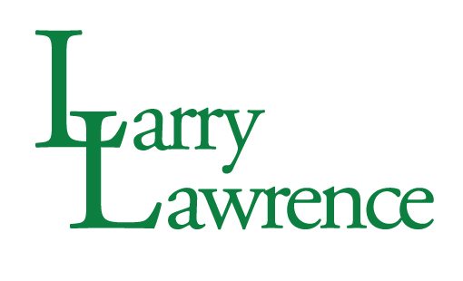
While the chat bubble is a fairly recent phenomenon that arose as a result of social media, this logo trend dates back several decades. In fact, for as long as their have been law firm logos, this idea has been going strong.
It can be used with almost any two capital letters but any time you have a double “L” you can bet good money that this idea is going to pop into your head. My advice: resist it with everything in you. It’s completely generic and is in fact the very first idea that countless non-designers would run to in this situation. Given that you do this for a living, I know you can come up with something a little better.
Notice a Theme?
Take a good look at the cliché logo ideas that we just went over. Notice anything similar about all of them? The answer is that they’re all super easy to replicate. The problem with many designers is not that they aren’t capable of coming up with great ideas, it’s that they’re too lazy and tend to run with the idea that’s quickest to bust out. Contrast this idea with something like the Starbucks logo:
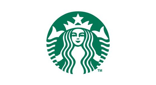
This is a really quirky logo that looks and feels truly unique. The custom illustration uses beautiful symmetry and repetition and the siren is anything but a cliché icon. Ripping off the logos above would take any designer ten minutes or less. Mimicking this idea is much more difficult. Admittedly, this isn’t always the case with strong logos, the Nike swoosh can readily be drawn by any twelve year old with a paint program.
However, the moral here is that any time you find yourself with the goal of making a strong brand icon that is completely own-able, try actually investing some solid time into your creation. The odds are that as you spend more time tweaking and refining your idea, the more unique it will become.
What Cliché Logo Ideas Have You Seen?
Now that you’ve seen my top five cliché logo trends, it’s time for you to join the conversation. In recent years, are there any logo ideas that you’ve seen seen that seem to get picked up and used over and over again? Share with us on Twitter @designshack!
Also be sure to let us know if you’re guilty of replicating any of the trends above. Don’t be ashamed, we’ve all come up with and even used horribly generic ideas so we might as well all laugh about it and learn from the comedy of the situation.
